How to Infuse European Style into California
July 28, 2014 Filed under: The Buzz

Sleek statement lighting in your classic space? Sharp contrast in texture and color in your kitchen or bath? Nobody does it better than the Italians, but this is a style trending not only in Europe, but in California too.
While touring the city and Milan’s Salone, I found recurring design trends throughout showrooms, displays, and kitchen and bath collections that reminded me of home and the simplicity of California design. Check out my ideas for blending styles, periods, elements and materials that fit perfectly with the West Coast aesthetic.
Industrial Chic
The design industry has become a hotbed for reusing and repurposing items and found objects. With the renewed appreciation for both hand-forged items and pairing vintage ephemera with modern functionality, rust and patina have gone from con to pro in the kitchen and bath arena. The combination of those timeless textures with the contemporary form and finish of the appliances and fixtures we use in those spaces is exactly the kind of juxtaposition that makes for great design - and conversation.
Customized Pieces
From monogrammed islands to refrigerators that wear wall coverings, homeowners can crank up the creativity and easily create and original space that is all their own. While in Milan, we found refrigerators that accept three different stylish patterns that will bring some zing to the kitchen and saw faucet finishes in a variety of splashy colors. Adding color and texture in places we would never expect to see anything but the 'same old finishes' makes a custom element read more like a piece of art.Mixed Materials
From reclaimed wood with sleek solid surfaces to aged metals with high-polish finishes, mixing and matching materials has never been more popular. Warm, modern looks are both sleek and inviting in kitchen and bath spaces. We love this Team 7 kitchen with industrial sink and range-top fixtures paired with rustic, earthy cabinetry and oversized pendant lamps that bring both looks together and keep the function in focus. With such a successful blend of styles, you can take the whole look in any direction just by switching out the accent pieces.Statement Lighting
While this look has been trending for a while, it only seems to be gaining more steam at the Salone. Again and again, we spotted large overhead lighting fixtures featuring repetitive patterns in a variety of spaces from design vignettes of kitchens and living spaces to show rooms, shops and museums. Statement lighting also does double duty, adding the drama that the lighting provides to the drama of the piece itself. Go fun, go funky, go industrial, or go classic - but go big and go bold!
Moveable + Convertible
Upper sliding cabinets and moveable island tops were a show-stopper at the Salone. With living spaces that blend into kitchen areas, the functional "hub of the home" can easily transition into a multifunctional living retreat. Armoire fronts simply slide in front or camouflage appliances while faucets collapse and remote-controlled island tops slide over a sink of dishes to create a new surface for entertaining. This is classic Euro-California with its cool textures, bold colors, contemporary accents and out-of-the-box design that really allows technology do so much more of the kitchen work for us.
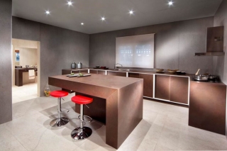
Warm Neutrals in the Kitchen
Taking cues from natural stones and earth tones, floating glass appliances have replaced the typically expected stainless steel versions. Coordinated elements in soothing hues were also found in solid surfaces as well as cabinetry finishes. Bright pops of color and a minimalist approach really redefine the traditional vision of a kitchen as the workhorse of the home.Bold Contrast in the Bath
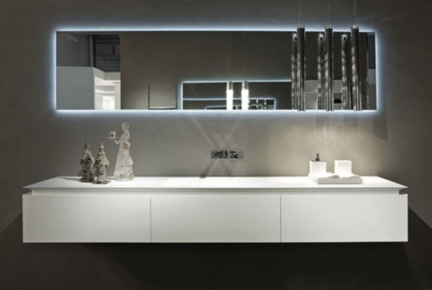
Black and white proved to be the height of chic in bathroom spaces. Matte white or black faucets and floors paired with high-polish tops and cabinetry provide an ultra-glam look for large- and small-scale spaces. Indirect vanity lighting around the mirror or even the base complements the clean lines and super sheen to add a serene spa vibe to a super modern space. Time and time again, we saw bold choices in contrasting elements pay off in a big way, doing double duty in terms of both design and functionality.

Article by Kerrie Kelly
CaHomeDesign